OF COURSE I LOVE the uniform but its a THROWBACK not a COLOR RUSH?
COLOR RUSH should have been BIG BLUE!
In physics, a color is visible light with a specific wavelength. Black and white are not colors because they do not have specific wavelengths. Instead, white light contains all wavelengths of visible light. Black, on the other hand, is the absence of visible light.
who likes the "NY" on the helmet better than "GIANTS" and thinks the 80s uniforms - notwithstanding the fantastic memories the team created while wearing them - are overrated?
I like the current, older logo, the current color scheme better than the 80s/90s version. That said, I also think that the current uniform is somewhat drab and needs to be updated.
*Hides from rotten vegetables*
I love the NY on the helmet much more than 'Giants'
But lets be real, the 80's unis have a lot of emotional attachment to so many. It's a shame we havent seen them in so long. I'd love to see this once a year.
I'm buying one, no doubt about it. These should be our permanent road uniforms, IMO. Love the "GIANTS" on the helmet, too. That's the helmet I grew up with. What a great day.
Much Better than some of the other pictures posted
but it's kind of a bummer that these "one night only" uniforms are not only something we've seen before and it no way new, but they're more or less Buffalo's current away uniforms. At the end of the day I don't really care about the uniforms. I'm not a jersey guy to begin with, my last one was Eli's his rookies year, just saying...
But lets be real, the 80's unis have a lot of emotional attachment to so many. It's a shame we havent seen them in so long. I'd love to see this once a year.
I'd have no problem with that - but just not permanently.
The helmet only changed to "Giants" when the team moved to NJ and they didn't want to offend their new home state. The team having gotten over that by 2000, there is no need to go back.
For comparisons sake...they really didn't try hard here...
but probably because I grew up with it and I think the Giants underlined is a bit old looking. That being said, I think it's awesome to bring it back for a game.
RE: For comparisons sake...they really didn't try hard here...
who likes the "NY" on the helmet better than "GIANTS" and thinks the 80s uniforms - notwithstanding the fantastic memories the team created while wearing them - are overrated?
I like the current, older logo, the current color scheme better than the 80s/90s version. That said, I also think that the current uniform is somewhat drab and needs to be updated.
*Hides from rotten vegetables*
.
I have always liked the NY better! I think with Ed Koch
howling back in the day, and they also had 'The Meadowlands'
logo at midfield was an ulterior motive why they had
'Giants' on the helmet. They talked about it on the
'Jerseys Boys', talking about the O Line back then.
RE: RE: For comparisons sake...they really didn't try hard here...
You do know the Giants worse these uniforms in the 80s and 90s, right?
Nope, I had no idea. I just started following the team a few months ago.
Did you bother reading my other post? Ya know, the one that said "Look, I'm all for a 80s throwback at some point, but it's kind of a bummer that these "one night only" uniforms are not only something we've seen before and in no way new"?
Meh. Anything else would've most likely been butt-ass ugly. Especially if it was something like the 1933 uniforms that were rumored earlier on. These are much better, IMO.
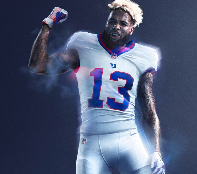
It is a "color rush" because the whole uniform is one color
are obviously all welcome, I just definitely disagree on the helmet. I think the NY Giants helmet with the ny is the most perfect part of any uniform period. Its like a BMW M5
because of last year's backlash from the colorblind community who had issues watching the games.
For example, the browns and ravens were supposed to wear all brown and all purple respectively, but apparently people with vision problems would not have been able to tell them apart, so the Browns will wear white.
I became a fan in the early to mid '90s during the Dan Reeves/Dan Brown era and watched them lose too many games in those helmets and have no offense outside of Rodney Hampton. I wish they'd wear these all season to be honest.
If it is only for one game, who cares what they wear?
It seems like the NFL and Nike are just trying to sell more NFL apparel to fans, rather than improve the current uniforms.
Quote:
On Tuesday, the NFL pulled back the curtain on Color Rush uniforms for all 32 teams, and they�re � colorful. The jerseys will be worn on Thursday night games this season, but as a result of the limited-use uniforms, not every team will be wearing them in 2016.
A total of nine teams won�t be wearing the alternate uniforms this season for a couple of reasons. Either their lone Thursday night game falls on Thanksgiving � which isn�t a part of the program in 2016 � or their opponent�s colors would cause colorblind issues.
Those teams playing on Thanksgiving that won�t get the chance to don Color Rush jerseys are the Colts, Redskins and Lions. They�ll have to wait until 2017.
I understand if they call it "retro" or "old school". This isn't anything new. The Color Rush campaign, I thought, was to introduce new uniform concepts.
I understand if they call it "retro" or "old school". This isn't anything new. The Color Rush campaign, I thought, was to introduce new uniform concepts.
Maybe its a compromise from the hideous ones last year


GIANTS!!!!!!!
TAKE MY MONEY NOW!
COLOR RUSH should have been BIG BLUE!
In physics, a color is visible light with a specific wavelength. Black and white are not colors because they do not have specific wavelengths. Instead, white light contains all wavelengths of visible light. Black, on the other hand, is the absence of visible light.
I like the current, older logo, the current color scheme better than the 80s/90s version. That said, I also think that the current uniform is somewhat drab and needs to be updated.
*Hides from rotten vegetables*
Just bought the Eli jersey and my son the Beckham. Take my money!!!!!
And update the current home one with the same thicker red/blue striping and red number outline and keep the white pants.
I'd have no problem with that - but just not permanently.
The helmet only changed to "Giants" when the team moved to NJ and they didn't want to offend their new home state. The team having gotten over that by 2000, there is no need to go back.
That's why I don't get overly excited about the uni's,
as long as they don't wear the god awful red, I'm good.
Way better than the "ny" logo.
You do know the Giants worse these uniforms in the 80s and 90s, right?
I like the current, older logo, the current color scheme better than the 80s/90s version. That said, I also think that the current uniform is somewhat drab and needs to be updated.
*Hides from rotten vegetables*
I have always liked the NY better! I think with Ed Koch
howling back in the day, and they also had 'The Meadowlands'
logo at midfield was an ulterior motive why they had
'Giants' on the helmet. They talked about it on the
'Jerseys Boys', talking about the O Line back then.
Quote:
You do know the Giants worse these uniforms in the 80s and 90s, right?
Did you bother reading my other post? Ya know, the one that said "Look, I'm all for a 80s throwback at some point, but it's kind of a bummer that these "one night only" uniforms are not only something we've seen before and in no way new"?
Not a fan of this particular classic look.
Quote:
In comment 13120216 j_rud said:
Quote:
You do know the Giants worse these uniforms in the 80s and 90s, right?
Nope, I had no idea. I just started following the team a few months ago.
Did you bother reading my other post? Ya know, the one that said "Look, I'm all for a 80s throwback at some point, but it's kind of a bummer that these "one night only" uniforms are not only something we've seen before and in no way new"?
Meh. Anything else would've most likely been butt-ass ugly. Especially if it was something like the 1933 uniforms that were rumored earlier on. These are much better, IMO.
White is the presence of all colors; black is the absence of color.
For example, the browns and ravens were supposed to wear all brown and all purple respectively, but apparently people with vision problems would not have been able to tell them apart, so the Browns will wear white.
Hmmm..?
Another brilliant post from BBI's resident agitator and contrarian fuckstick.
Yup reminds me of the Bills 90s uniform actually. From XXV.
A total of nine teams won�t be wearing the alternate uniforms this season for a couple of reasons. Either their lone Thursday night game falls on Thanksgiving � which isn�t a part of the program in 2016 � or their opponent�s colors would cause colorblind issues.
Those teams playing on Thanksgiving that won�t get the chance to don Color Rush jerseys are the Colts, Redskins and Lions. They�ll have to wait until 2017.
The Giants wore these unis in the 80s.
Quote:
it is the absence of color
White is the presence of all colors; black is the absence of color.
I thought when it came to light that white is all colors. But when it comes to pigment, black is all colors.
Maybe its a compromise from the hideous ones last year