Are the 80s Simms/Taylor glory years where Red was a nice, minimal ACCENT color. Use white pants, and replace the NY with the old GIANTS logo on the newer, metallic blue helmet and call it a day.
Stop with all this RED. You're NOT the fucking Montreal Canadians.
John Mara could save a drowning Boxer puppy and some of you would lambaste him because you prefer Dachshunds. Christ, lighten up - or at least learn how to compartmentalize your frustrations.
I hate uniforms where the numbers have outlines/piping around them.
It looks a lot classier / cooler WITHOUT that 1970s Oakland A's piping bullshit. I know it was there in the Parcells years but I find those uniforms uninspiring.
better than the one red stripe down the middle which I hate. I like the Jerseys also a really nice throw back. BUT those pants man. Isn't there any other pants in our history that we can honor hahaha
Can't disagree, but since today's players will never go back to a cage that robust, I'd settle for the rarest of the rare, the NOPO-DW...aka the Brad Van Pelt.
Are the 80s Simms/Taylor glory years where Red was a nice, minimal ACCENT color. Use white pants, and replace the NY with the old GIANTS logo on the newer, metallic blue helmet and call it a day.
Stop with all this RED. You're NOT the fucking Montreal Canadians.
Agreed, this choice is hideous. Right up there with the Steelers bee uniform.
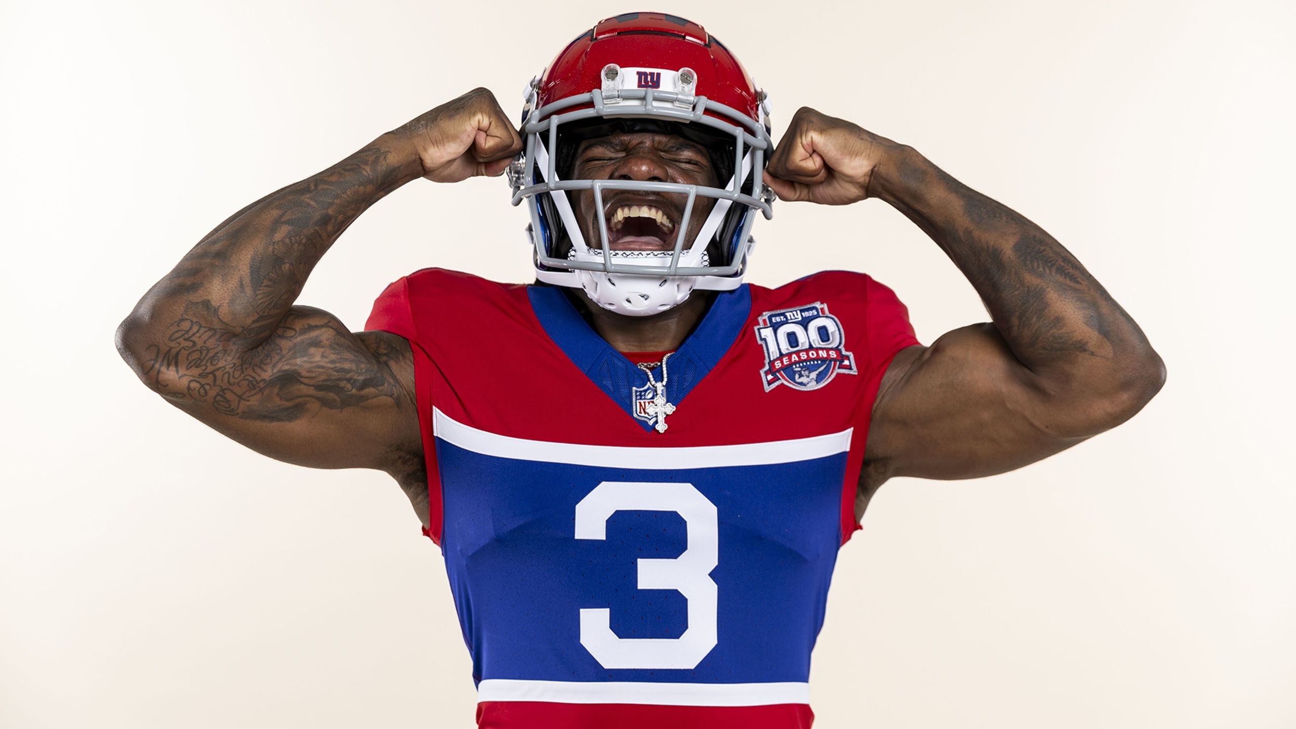
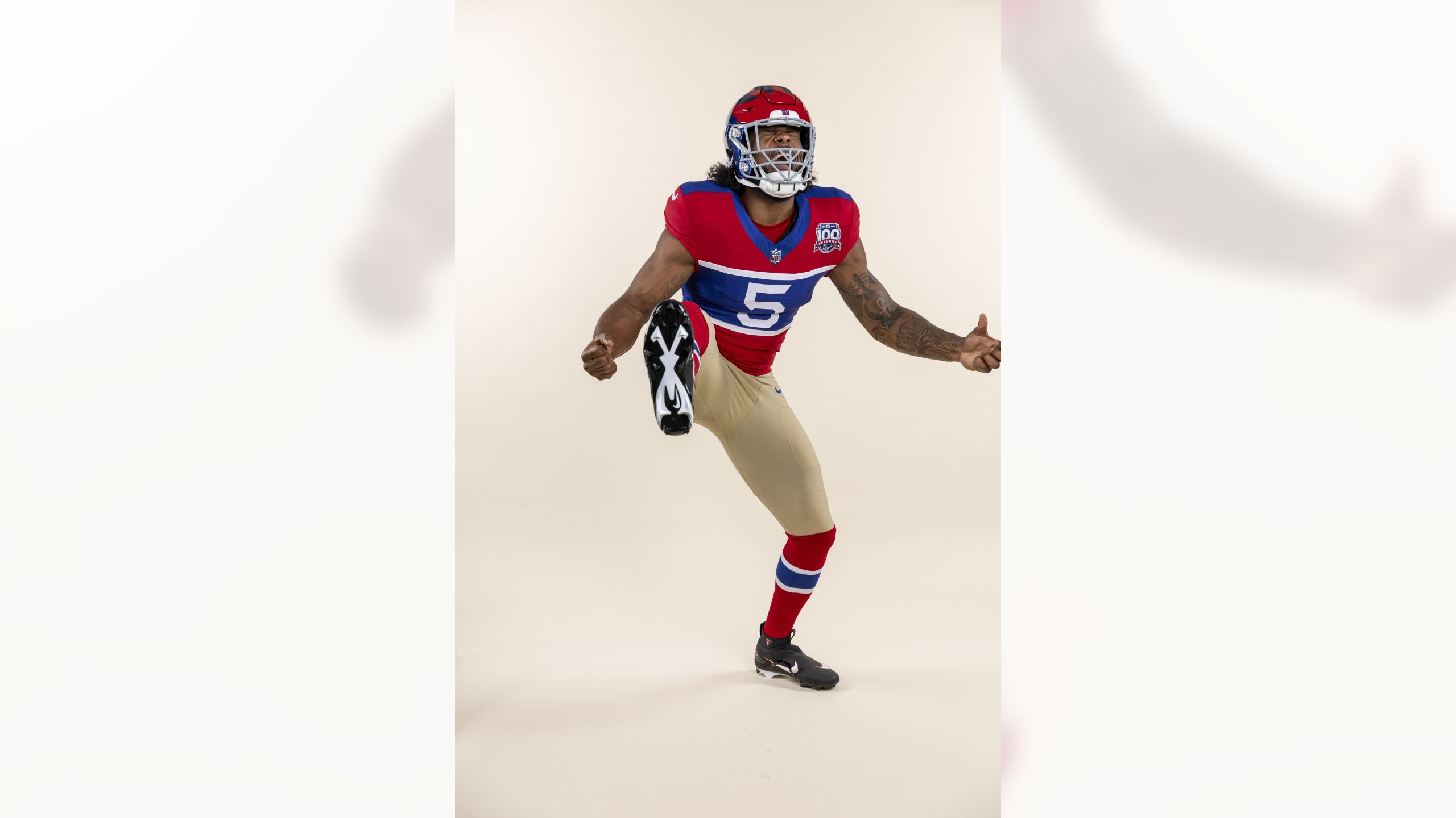
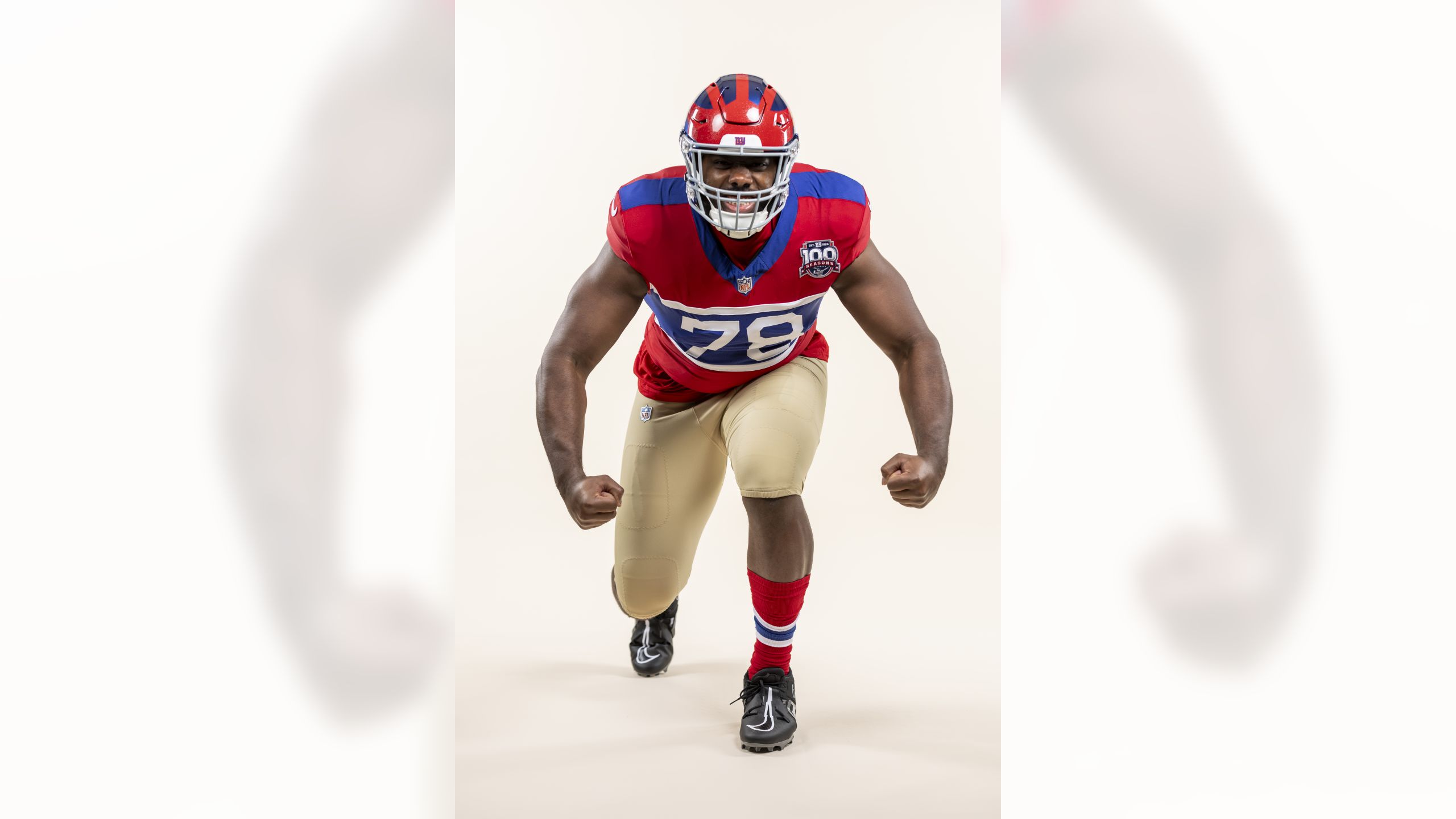
about hoping they would go to a 1930s throwback uni and the winged helmet. I’m surprised they did it. This isn’t the look I would’ve chosen. But this fits in well with the “color rush“ concept and certainly pays tribute to the history of the team.
I agree that the tan pants don’t seem to me to fit with the jersey and helmet, but that’s a quibble.
Do I want to see them go to this permanently? Hell no. Am I glad to see it now and then? Hell yes.
There’s a 1930s look with blue and white running down the sleeves. I actually like that one better. If they issued one of those I might buy it. But for 100th anniversary jersey I have no complaints here.
The 49ers make red jerseys with gold pants work. These uniforms don't. Perhaps it's the 49ers gold helmets that make the difference.
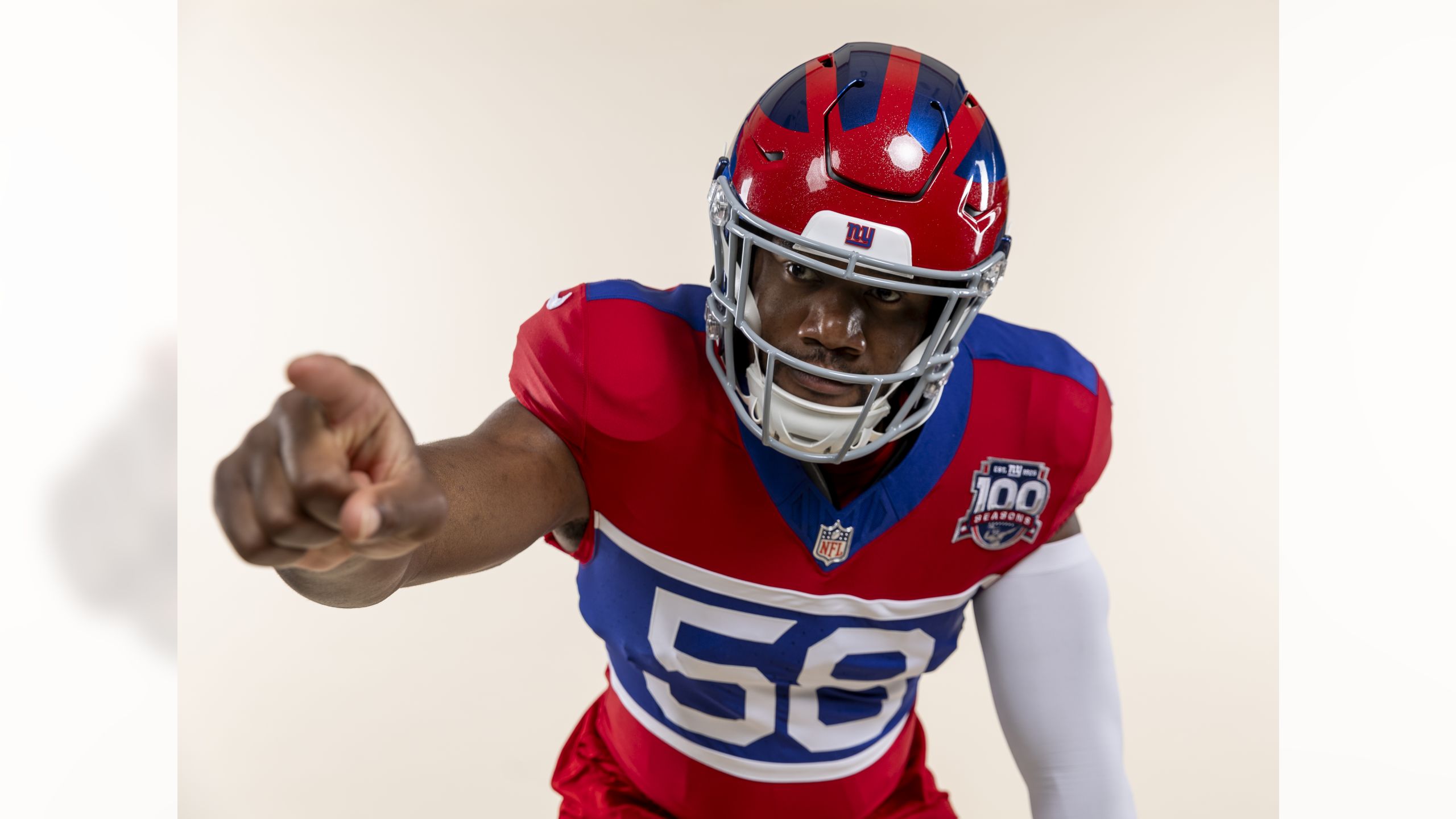
These helmets have no number or Giants logo on it. Keeping track of whose helmet is whose should be a lot of fun. Not to mention trying to identify players in photos or on TV. It would make a nice motorcycle helmet.
Hahaha! With all the bitching going on in this thread you'd think the Giants were going with these! There late 70s uniforms are the truly ugly ones.
It's probably a little known fact that Andy Robustelli, who was the Giants D.O. of Football Ops, designed these himself. He wanted the Giants to shake off their image of being a stuffy, old organization stuck in the past and thought a modern look would help.
Fortunately, they didn't last long.
Except for 1975, which I think was an all around terrible year for pretty much everyone, especially giants uniforms, I like all of the Giants uniforms, including the various alternates and throwbacks. Personally I slightly prefer the late 80's, but I like the 60's and the 2000's refresh. I like these new throwbacks too.
One thing I actually like about the 1975-79 uniforms
about hoping they would go to a 1930s throwback uni and the winged helmet. I’m surprised they did it. This isn’t the look I would’ve chosen. But this fits in well with the “color rush“ concept and certainly pays tribute to the history of the team.
I agree that the tan pants don’t seem to me to fit with the jersey and helmet, but that’s a quibble.
Do I want to see them go to this permanently? Hell no. Am I glad to see it now and then? Hell yes.
There’s a 1930s look with blue and white running down the sleeves. I actually like that one better. If they issued one of those I might buy it. But for 100th anniversary jersey I have no complaints here.
Adding: The 1930s jerseys had long sleeves and look better that way.
Uniforms in the 1930's were like this. Have you seen the Packers uniforms from back then, Eagles, Steelers? They've all worn them in recent years.
For what this is commemorating, I think they did a great job. I wouldn't spend money on this jersey, but they got all of the details correct. Curious about what the endzone design will be for the two games they wear them. Assuming they are both home games.
I don't understand the concept behind giving a blue, red, and white striped jersey....gold pants.
Like, how does gold go with red, white, and blue? Did Hellen Keller come up with that design concept? The gold pants just are "Giant-ish" in the least, and gold certainly doesn't go well with red, white, and blue. It just doesn't look right.
that's what all teams wore in the 1920s and 1930s, colored pants started showing up in the mid-late 30s.
What the NFL looked like in 1933. - ( New Window )
Ok, tan not gold. Even still, tan doesn't go with red, white, and blue.
Than modern football uniforms. It’s a peculiar marriage of styles
I hope someone wears matching red long sleeves with that jersey, it’ll look better.
The biggest problem with modern NFL jerseys is they don't really have sleeves anymore, they just have shoulder caps. That's why TV numbers are worn on the shoulder, and some teams (Bengals) don't even have them anymore.
The posters above who said the long sleeved jerseys from the 1920s looked like rugby shirts are correct, essentially that's what they were - long sleeved wool sweaters (which must have been miserable to play football in early in the season on a hot day).
The first significant change in jersey design came with the switch to durene, which is a much lighter fabric and remained the base material for most football jerseys going into the 1970s. The Giants made the change to durene in 1934. The change in material also changed the way the teams looked as striping left teh body of the jersey and moved almost exclusively to the sleeves - football jerseys began to adopt what most of us see as their typical look.
For the Giants, this throwback jersey really is an attempt to trace back to their early roots, a long sleeved wool rugby-style shirt. Not an easy thing to do on a 21st century material with a minimalist cut (body forming without sleeves). Personally, I think it looks good, but I look at it through a different lense as I've spent the better part of 12 years looking at football photos in newspapers from the 1920s, 1930s & 1940s for the Gridiron Uniform Database. I appreciate all the work that went into it.
The origin of NFL throwback uniforms goes back to 1993 when the Jets commemorated the 25th anniversary of SBIII.
The following year was the NFL's 75th anniversary and almost the entire league wore throwback uniforms to some point in their histories. the results, while not always historically accurate, were very interesting. The Cardinals, Bears and Steelers wore uniforms going back to the 1920s and 1930s, hence their tan pants - they are historically accurate. For that year the Giants wore 1962 uniforms (the league made them wear white pants with the blue jerseys for some unknown reason). 1994 NFL 75th anniversary throwback uniforms - ( New Window )
Thanks for the explainer Larry, appreciate the explanation and your site. Looks like a lot of research has gone into it and I’m gonna spend some time on there.
Personally I think these are cool. Very different than anything else in the league from a throwback perspective and they pop!, especially the awesome helmet.
Opinions being what they are, if you can’t get into this from the historical perspective, yeah even the tan pants…. In a few years there will probably be some hideous black & blue infused kit to spend your money on.
My major complaint - the colors are too vibrant for the design


Stop with all this RED. You're NOT the fucking Montreal Canadians.
I want a new jersey and I love these.
It looks a lot classier / cooler WITHOUT that 1970s Oakland A's piping bullshit. I know it was there in the Parcells years but I find those uniforms uninspiring.
Jerseys ok….pants look like 49ers….was hoping for a black/blue theme
Exactly what I was thinking too. Love the helmets....very Michigan-esque
I want a new jersey and I love these.
I haven't been able to find anything about this. If I do I'll let you know and if you see something please let me know. Thanks!
I am undaunted by your replies. Tan pants rule and you will not dissuade me.
https://twitter.com/TomPelissero/status/1791117157700448400 - ( New Window )
Can't disagree, but since today's players will never go back to a cage that robust, I'd settle for the rarest of the rare, the NOPO-DW...aka the Brad Van Pelt.
Stop with all this RED. You're NOT the fucking Montreal Canadians.
Agreed, this choice is hideous. Right up there with the Steelers bee uniform.
I agree that the tan pants don’t seem to me to fit with the jersey and helmet, but that’s a quibble.
Do I want to see them go to this permanently? Hell no. Am I glad to see it now and then? Hell yes.
There’s a 1930s look with blue and white running down the sleeves. I actually like that one better. If they issued one of those I might buy it. But for 100th anniversary jersey I have no complaints here.
Quote:
Thanks Rick 😀 I will.
Will we be able to buy one?
I want a new jersey and I love these.
I haven't been able to find anything about this. If I do I'll let you know and if you see something please let me know. Thanks!
These helmets have no number or Giants logo on it. Keeping track of whose helmet is whose should be a lot of fun. Not to mention trying to identify players in photos or on TV. It would make a nice motorcycle helmet.
Now that's a classic.
Now that's a classic.
Hahaha! With all the bitching going on in this thread you'd think the Giants were going with these! There late 70s uniforms are the truly ugly ones.
It's probably a little known fact that Andy Robustelli, who was the Giants D.O. of Football Ops, designed these himself. He wanted the Giants to shake off their image of being a stuffy, old organization stuck in the past and thought a modern look would help.
Fortunately, they didn't last long.
That is right. The Giants are not in Montreal. They are the Hab-nots.
I think they're pretty ugly but obviously fashion is subjective. Happy some of ya'll like like them. The pants are horrendous.
Agree. The blue pants were awesome with the white road jerseys.
I agree that the tan pants don’t seem to me to fit with the jersey and helmet, but that’s a quibble.
Do I want to see them go to this permanently? Hell no. Am I glad to see it now and then? Hell yes.
There’s a 1930s look with blue and white running down the sleeves. I actually like that one better. If they issued one of those I might buy it. But for 100th anniversary jersey I have no complaints here.
For what this is commemorating, I think they did a great job. I wouldn't spend money on this jersey, but they got all of the details correct. Curious about what the endzone design will be for the two games they wear them. Assuming they are both home games.
Like, how does gold go with red, white, and blue? Did Hellen Keller come up with that design concept? The gold pants just are "Giant-ish" in the least, and gold certainly doesn't go well with red, white, and blue. It just doesn't look right.
What the NFL looked like in 1933. - ( New Window )
What the NFL looked like in 1933. - ( New Window )
Ok, tan not gold. Even still, tan doesn't go with red, white, and blue.
I hope someone wears matching red long sleeves with that jersey, it’ll look better.
I hope someone wears matching red long sleeves with that jersey, it’ll look better.
The biggest problem with modern NFL jerseys is they don't really have sleeves anymore, they just have shoulder caps. That's why TV numbers are worn on the shoulder, and some teams (Bengals) don't even have them anymore.
The posters above who said the long sleeved jerseys from the 1920s looked like rugby shirts are correct, essentially that's what they were - long sleeved wool sweaters (which must have been miserable to play football in early in the season on a hot day).
The first significant change in jersey design came with the switch to durene, which is a much lighter fabric and remained the base material for most football jerseys going into the 1970s. The Giants made the change to durene in 1934. The change in material also changed the way the teams looked as striping left teh body of the jersey and moved almost exclusively to the sleeves - football jerseys began to adopt what most of us see as their typical look.
For the Giants, this throwback jersey really is an attempt to trace back to their early roots, a long sleeved wool rugby-style shirt. Not an easy thing to do on a 21st century material with a minimalist cut (body forming without sleeves). Personally, I think it looks good, but I look at it through a different lense as I've spent the better part of 12 years looking at football photos in newspapers from the 1920s, 1930s & 1940s for the Gridiron Uniform Database. I appreciate all the work that went into it.
The origin of NFL throwback uniforms goes back to 1993 when the Jets commemorated the 25th anniversary of SBIII.
The following year was the NFL's 75th anniversary and almost the entire league wore throwback uniforms to some point in their histories. the results, while not always historically accurate, were very interesting. The Cardinals, Bears and Steelers wore uniforms going back to the 1920s and 1930s, hence their tan pants - they are historically accurate. For that year the Giants wore 1962 uniforms (the league made them wear white pants with the blue jerseys for some unknown reason).
1994 NFL 75th anniversary throwback uniforms - ( New Window )
Quote:
Than modern football uniforms. It’s a peculiar marriage of styles
I hope someone wears matching red long sleeves with that jersey, it’ll look better.
The biggest problem with modern NFL jerseys is they don't really have sleeves anymore, they just have shoulder caps. That's why TV numbers are worn on the shoulder, and some teams (Bengals) don't even have them anymore.
The posters above who said the long sleeved jerseys from the 1920s looked like rugby shirts are correct, essentially that's what they were - long sleeved wool sweaters (which must have been miserable to play football in early in the season on a hot day).
The first significant change in jersey design came with the switch to durene, which is a much lighter fabric and remained the base material for most football jerseys going into the 1970s. The Giants made the change to durene in 1934. The change in material also changed the way the teams looked as striping left teh body of the jersey and moved almost exclusively to the sleeves - football jerseys began to adopt what most of us see as their typical look.
For the Giants, this throwback jersey really is an attempt to trace back to their early roots, a long sleeved wool rugby-style shirt. Not an easy thing to do on a 21st century material with a minimalist cut (body forming without sleeves). Personally, I think it looks good, but I look at it through a different lense as I've spent the better part of 12 years looking at football photos in newspapers from the 1920s, 1930s & 1940s for the Gridiron Uniform Database. I appreciate all the work that went into it.
The origin of NFL throwback uniforms goes back to 1993 when the Jets commemorated the 25th anniversary of SBIII.
The following year was the NFL's 75th anniversary and almost the entire league wore throwback uniforms to some point in their histories. the results, while not always historically accurate, were very interesting. The Cardinals, Bears and Steelers wore uniforms going back to the 1920s and 1930s, hence their tan pants - they are historically accurate. For that year the Giants wore 1962 uniforms (the league made them wear white pants with the blue jerseys for some unknown reason). 1994 NFL 75th anniversary throwback uniforms - ( New Window )
Thanks for the explainer Larry, appreciate the explanation and your site. Looks like a lot of research has gone into it and I’m gonna spend some time on there.
Personally I think these are cool. Very different than anything else in the league from a throwback perspective and they pop!, especially the awesome helmet.
Opinions being what they are, if you can’t get into this from the historical perspective, yeah even the tan pants…. In a few years there will probably be some hideous black & blue infused kit to spend your money on.